Some Inspiring Site Designs That Help Inspire Our Blissy Life Brand
As digital nomads and bloggers, we’re always seeking out new and interesting experiences to stretch and enrich us. That includes other travel and lifestyle websites! We’re also always keeping our eyes out for design elements and sassy wording that inspires the Blissy Life site.
Coming across an awesome website really excites us because:
- Wahoo! Look at our fellow humans rockin’ it!
- We get to be inspired by some awesome new ideas and design concepts.
There are soooo many folks doing cool things, but this would be a crazy long post if we included them all! So instead, here are a few sweet sites, and we’ll share a few more in another post some other time. Sound good? Okay, saddle up!
yTravel
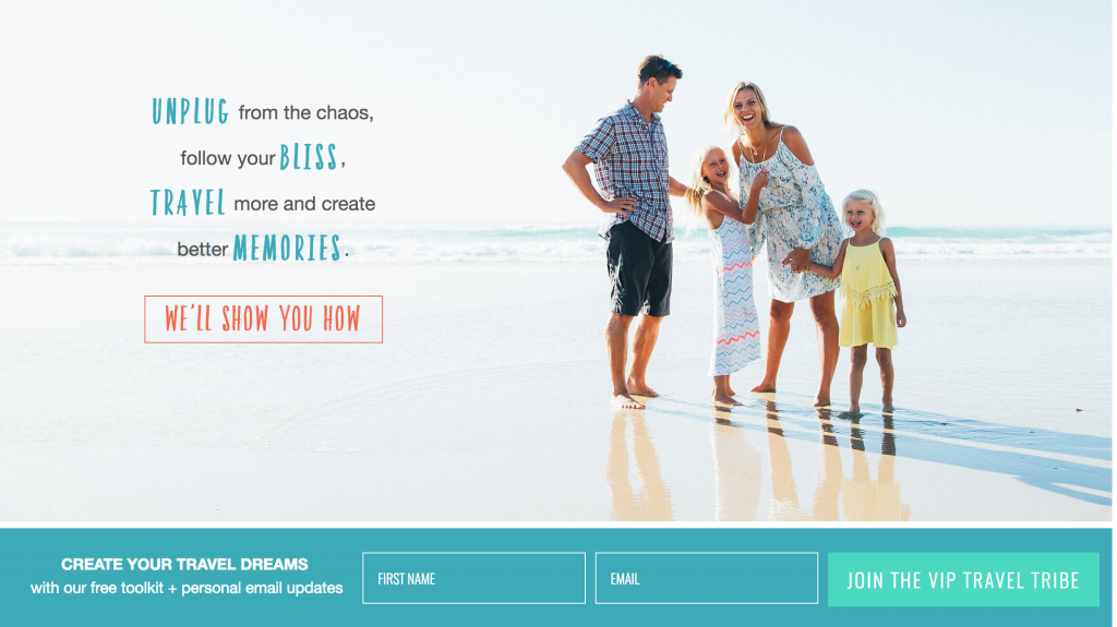
Caz and Craig Makepeace are the dynamic duo behind yTravel, a site that helps people travel more. Simple as that. And that’s what we love about this site — the simplicity. There’s a bold, clear statement of the problem (chaos) and the solution (we’ll show you how) right in the header, and the opportunity to pursue their solution (signing up) just below that.
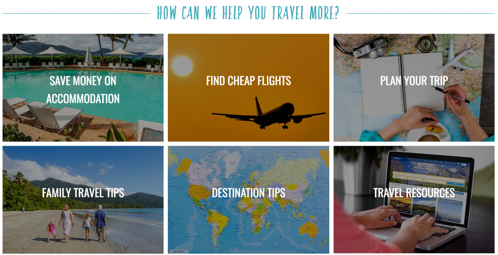
Scroll down a little further and you’ll find some very practical, clickable buttons with appealing images. The heading above those buttons plainly fleshes out their mission and how they can help. Each button touches on a specific pain point that might prevent someone from traveling, such as costs of flights or accommodations, the difficulty of planning, etc. When you click on one, you’re taken to a super comprehensive blog post that addresses whichever issue you clicked on, followed by links that will lead you to other blog posts that deal with the topic further. It’s a really smart way of incorporating deep links that feels natural and genuine.
The further down you scroll on the home page, the more cool stuff you find, from recent blog posts to current excursions and projects. Basically, they keep drawing you in with warm and inviting content and making it easy to identify with and love them.
Screw the Nine to Five
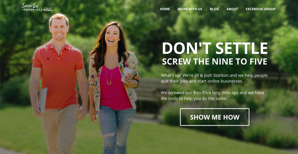
This is a fun one! Jill and Josh Stanton are the intrepid couple that quit their jobs, moved to Thailand, and founded Screw the Nine to Five to help other people do the same. These two have mastered the art of creating a sleek, professional look and feel without being too sales-y.
They’ve built out their brand from the business name in really fun and clever ways in their headers (“Choose how you want to screw”) and in their products (their private community, “Screw U”) and they’ve created their own sort of slang with it throughout the website, calling themselves the “Chief Screwers” and affectionately referring to their business as “The Screw”. This is masterful copywriting and branding!

Their About Us page (which is easily accessible from the main navigation bar at the top of every page) is especially juicy, engaging site visitors at differing levels of commitment. It opens with copy describing the problem that their business aims to fix and explaining how they fix it. They then offer an option to skip ahead to the meat and potatoes for those who already know that they want to make a purchase. For those who are still interested, but need a little more prompting, Jill and Josh dive in with their story and a cool timeline of their business journey.
Both the ready-to-go visitors who skipped ahead and the not-quite-sure visitors end up at the bottom of the page, where they’ll find three very clear CTAs (Calls to action) to help them get started at various levels. It’s a pretty sweet, natural-feeling progression that, again, doesn’t feel sales-y, but rather fun and helpful. And again — kick-ass, relatable copywriting throughout.
Mindvalley
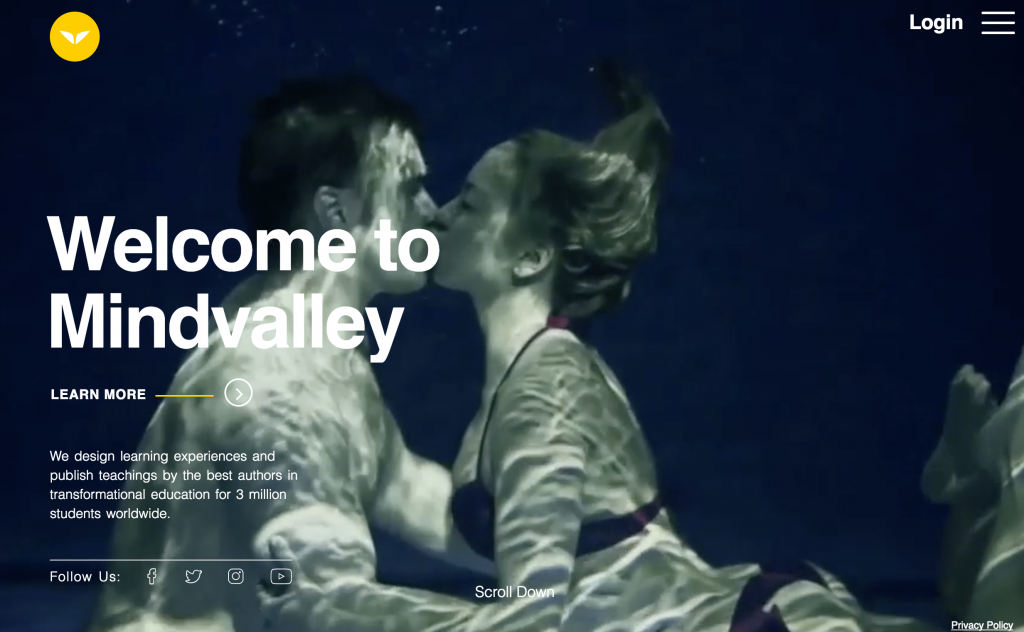
This one’s not a travel site, but we found it insanely inspiring nonetheless, so we had to include it. Mindvalley is an education company that provides ideas and teachings from a variety of authors on a multitude of digital platforms. Their goal is to expand people’s boundaries to help them live extraordinary lives that they love. As you know, we’re all about that!
But what’s really awesome is that their website reflects their company philosophy and culture – It’s simple, fun, and sometimes pleasantly surprising. When you first enter the site you see a full-screen hero video with MASSIVE white titles (64px tall!). The video clips are varied and engaging, stirring a little thrill of excitement in you so that you want to learn more. And learning more is super easy. All you have to do is scroll down to find four clear, distinct sections introducing you to the company, founder (Vishen Lakhiani), culture, and team with more beautiful, full-screen images. Oh, and each section includes social buttons for easy connection whenever you want it.
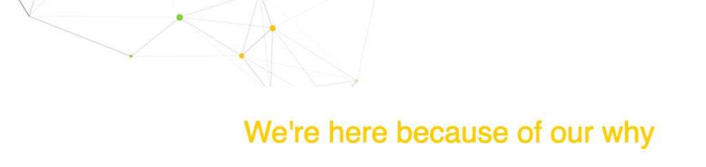
In each section, you can also click the “Learn More” button, which takes you to that section’s main page. Each page is laid out with the same simple format, which gives the website a nice, natural flow. Each page also has colorful little dots floating over a white background, connecting to other dots they pass with thin black lines and creating geometric shapes – and when you mouse over them, the dots connect with your cursor too, so you can essentially interact with the graphic! It’s a fun little extra that doesn’t detract from the larger message, but in fact, beautifully mimics the energetic, collaborative nature of the company. Super cool.
Our Awesome Planet
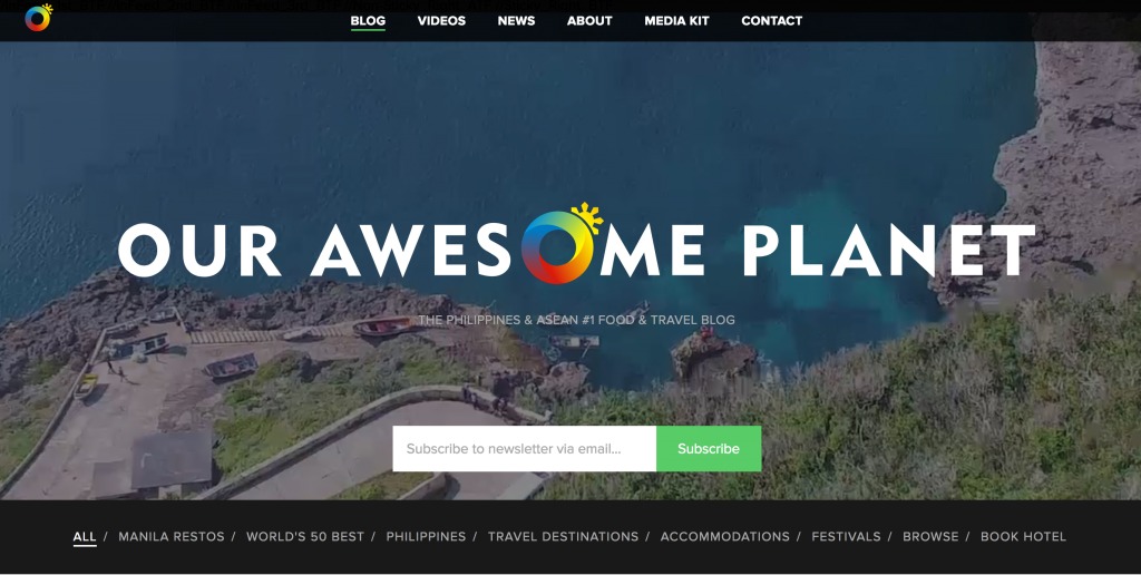
This site is a top-ranked food and travel blog focused on the Philippines and Asia. Anton Diaz is the founder and author of Our Awesome Planet, and he does some of the same great stuff as Mindvalley – There’s a video header with large, clean lettering. But we were also tickled to find a logo icon (the colorful “O” in awesome) that immediately establishes the brand and becomes a home navigation icon in the top left corner of every page. There’s also a field where you can sign up for their newsletter right in the header, which is awesomely convenient!
There’s a lot to see on this website, but the central navigation makes it very easy to get around. You’ll find the main navigation bar at the top of the page with “big picture” subjects like Blog, Videos, News, and About. You’ll also find a secondary navigation bar at the bottom of the header with more specific subjects like Accommodations, Festivals, and World’s 50 Best. Easy peasy.
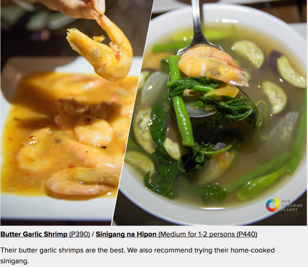
The content layout of the blog is fantastic. Each post is written like a photo essay, with lots of giant, juicy images and a sentence or two in between. The images are also shareable, with buttons to share on Facebook, Tumbler, Twitter, and Pinterest. It really immerses you in the experience of the writer, allowing you to see everything that they talk about. If that doesn’t fire up your wanderlust, I don’t know what will!
There’s lots to love about these website designs and the vision behind them.
We draw new insight from websites like this all the time to help us improve and grow. We encourage you to do the same! Dig into these websites and others that you like, and rather than reading passively, ask yourself probing questions about why you like them. It’s actually really fun! It also sharpens your eye for design and exercises your marketing muscle really well.
If you’d like a little more website design and marketing guidance, we can help you with that too!
Enjoy this post? Pin it for later!

Curtiss is a lover of delicious atmosphere, experiments in location independence (and digital nomadism), and that magical place where wifi and paradise overlap.